CV Writing 101: Design Basics
A stellar CV (resume) is your ticket to a job interview. Sadly, having great content isn’t the only thing that makes a great resume. How you present the information is just as important and if you’re CV is a cluttered mess, you may find yourself losing out on an opportunity.
That doesn’t mean you need some wacky, artsy CV though. In fact, there’s a huge debate about whether they add or detract from an application. My advice is, unless you’re applying for a graphic design gig, your CV design should essentially be invisible.
Your CV should be clean, drawing attention to what matters most: the content. Here are a few simple tips on how to keep things simple.
Typography
Times New Roman is simple enough, albeit overused. Feel free to use a different font. Warning: Don’t try to get too fancy. There’s no need for fancy script-like fonts or art-deco inspired typefaces.
Here’s a handy guide to all the fonts you’ll ever need: http://kadavy.net/allthefontsyoulleverneed-kadavy.pdf
Stick with a single font unless you’re truly design savvy. Don’t start mixing serifs and sans-serifs if you don’t know what you’re doing. And whatever you do, do not use Comic Sans!
Aligning, Bolding, Bulleting, And Many More -INGS
You want to differentiate between your titles and your paragraphs. That’s understandable. Instead of throwing in a million fonts in an attempt to highlight different things, thus, adding to the confusion, try playing around with just a single font. There are a surprising number of ways to distinguish information when you think about it.
- Align your name and contact information in the middle. Left-justify it. Centering your subtitles will make it stand out from the meat.
- Bold information you would like to stand out. For example, I like to bold all companies and organizations.
- Bullet secondary information (job descriptions, degree specifics, etc.)
- Putting TITLES or SUBTITLES in all caps is a good way of differentiating information.
- Remember to be consistent. If you choose to bold and center a subtitle, make sure every single subtitle is formatted the same way.
- I usually italicize any information having to do with me, including positions I’ve held and job titles.
- I wouldn’t mess around too much with font sizes besides making my name a little bigger (the power of the name!)
- And finally spacing. Make sure there’s white space for the eye to breathe. A cluttered CV will exhaust the reader before they even start reading.
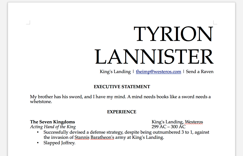
Here an example of a clean, easy-to-read CV incorporating several of the elements mentioned above:
Export file in PDF
Formatting can often be out of whack when different file types are opened in different word processors. I learned this the hard way when I opened my CV, which was saved as an .odt file, in Microsoft Word. Simply put, I wouldn’t have hired myself if I received that CV with a job application. By exporting your CV as a PDF, your CV formatting will practically be etched in stone; it will appear the same to everyone.
Conclusion: The purpose of your CV is to present your experience in a way that is easily digestible.